John Gerrard, Exercise, March 1st – April 14th
Simon Preston Gallery, 301 Broome Street
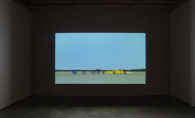
What’s on view: Two CG videos of blue- and red-clad runners and an army fatigue-clad soldier against a desert background
Corinna Kirsch: Watching Gerrard’s videos, you get to watch figures moving around a desert landscape, occasionally piqued by sky-high plumes of black smoke. The red-and-blue figures end up running in circles, and the army fatigue-clad one repeatedly performs the sort of generic motions common to video games, like a batting an invisible bat or kneeling in front of an invisible king. Seen over-and-over again, these repeated movements seem like some body endurance performance from the 1970s. It’s the same thing, just digital, and sprinkled with a war background. Never mind the politics, Bruce Nauman called and he wants his ideas back.
That’s harsh, okay, but these videos are boring! Maybe that’s the worse crime! Just please give me a reason to watch your video because watching people running in circles won’t suffice.
Whitney Kimball: Agreed, smart but boring. I’ll add that Gerrard pointedly bases these on real places that are politically loaded, and often the daylight in his videos corresponds with real time. (One of his earlier works “Daylight Fan (Orbital Camera),” for example, depicted a fan running in tandem with the sunlight coming through an animated window).
The red and blue figures are running on an actual African military base, and in the other, the man in fatigues references “a press image of a soldier observing burning Iranian oil refineries in 1980 and is joined in the exhibition by a new related work which represents these fires.” You would never make the connection from the videos alone, and then you need to make a conscious effort to do so from the press release. This to me feels like another game of academic chicken, where someone explains the work in exorbitant detail to convince you that it’s doing something that it’s just, inherently, not.
Lucas Ajemian and Julien Bismuth, Walks & Talks, March 15th – April 21st
Invisible Exports, 14A Orchard Street
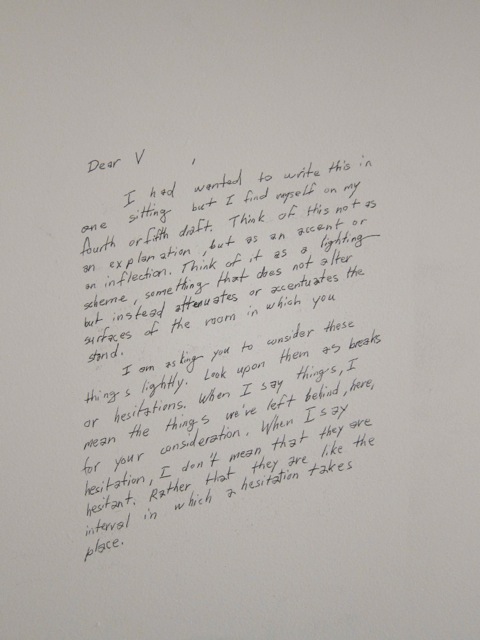
What’s on view: Folded up tables and chairs, a video of a group of people folding black triangles, and poetry on paper and walls
Whitney: I thought this was brilliant, but maybe just because there’s a clear puzzle to be solved in all of the paradoxical poems, and that makes me feel smart. People’s names are replaced with letters, and the poems describe simple exchanges that have to do with the passage of time, often talking about doing something and then realizing you’ve already begun. For example:
J: There is no point in starting.
K: This is a point.
J: That’s a start.
Another:
“There are occasions for hesitations, hesitations so innumerable, that I hesitate to enumerate them here.”
The allusions to fold-up tables, origami, and lanterns made me think of how projects are never really finished, and ideas and art movements just sort of ebb and flow based on when you need to pull them out again.
Corinna: One of my favorite stops on our “We Went to…” tour this week, but only ‘cause of the poems. The videos and chairs didn’t add much to setting a scene, and honestly, the amount of detail in the poetry prints—nice typeface, paper, and scale—contrasted too heavily with the casually scattered chairs and tables.
The poems reminded me of e.e. cummings or Wallace Stevens on a more restrained day (Whitney chose a great one above); like both of those guys, Lucas Ajemian and Julien Bismuth, are really great at creating rhythms from everyday language.
I really like this short quip about the show from the press release: “The collaborative duo Lucas Ajemian and Julien Bismuth can’t stop talking to each other.” That might not mean all too much, but I do believe, like a handful of critics I know, that talking and writing with each other is vastly more fruitful—and interesting—than working alone.
Judith Braun: May I Draw, March 3rd – April 21st
Joe Sheftel, 24A Orchard Street
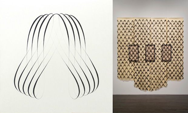
What’s on view: A mix of drawings, both digital-looking waves and what look like paper curtains made from fingerprints
Whitney: I’d come into this thinking it was a group show, and that the Judith Braun (with trademark finger marks) was by far the best. Turns out they’re all hers, but unlike the others, the fingerprints manage to be both painful in a Janine Antoni sort of way (physically, it makes my fingers feel raw) and three dimensional, with fingerprints getting lighter around the edges. (If you know Braun from Work of Art, it was impossible to see this quality on TV). When looking at her drawings on the computer screen now, it’s easier to see how the digital-looking drawings echo the shapes of five fingers pulling downward. That’s interesting to me as another approach to the same idea, but the cold screensaver quality makes me appreciate the handmade a lot more.
Paddy Johnson: Judith’s a friend of mine, so let’s just assume I’m not entirely objective. I agree that the fingerprints were the strongest for the same reasons you identify; their human dimension. Arguably, that’s less prominent in the graphite symmetrical procedure drawings where the hand pencilled graphite covers most of the page, but I’ve sometimes found the rhythm of the mark distracting from the sinuous curves she’s made. The drawing that looks like an upside down crown-like shape seems the best of that body of work, because the direction of the line is a little more consistent visually.
I gotta say, I think some of the painfulness you identify in the fingerprint paintings exists in the white symmetrical drawings. They are so careful and tension ridden, you can almost imagine the death grip Braun must have on her pencil. The drawing that looks like a shaking leaf, “Symmetrical Drawing CC-10-6”, is good for that.
I’d be happy if these works had a bit more descriptive titles. Their uniformity implies a level of sameness inconsistent with the actual drawings.
Corinna: I get what you guys are saying, but I just saw a lot of rigid, controlled shapes, and some that looked like tribal tattoos. Even the fingerprint drawings didn’t have much soul.


Comments on this entry are closed.