
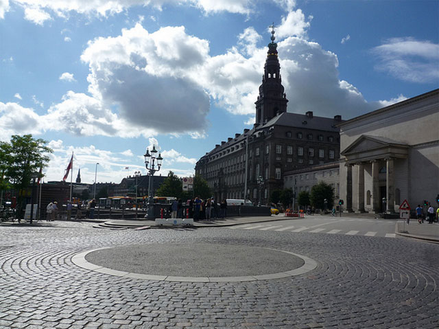
Copenhagen in August
“This is not a biennial” Festival Manager Lene Crone Jensen told the press gravely last week at the Copenhagen Art Festival. Coulda fooled me; the Copenhagen Art Festival already has the generic biennial-specific themes and inflated art-speak to make the transition an easy one should it so chose. “What are the implications of constituting a discourse of communities?” asks a bit of copy on the Copenhagen Art Festival website, as it describes the community minded-theme of the festival. It sounds like biennial.
Whatever it is, it’s not especially remarkable. Run every four years rather than two and organized by five of the city’s museums, many of these institutions didn’t so much interpret the word “community” as they did seek out illustrations. With a formula like that, it’s hard to produce shows that ask audiences to look differently than they already do. There were a few highlights, however, so I’ve taken a bit of space below to go over these, along with some of the lowlights. I’ll be discussing Kunstforeningen GL STRAND, Nikolaj Kunsthal, Kunsthal Charlottenborg, and Arken. Overgaden and Den Frie Udstillingsbygning also participated, but aren’t mentioned in this write up.

Pascale Marthine Tayoua, Favelas A, 2012
Kunstforeningen GL STRAND – Unfinished Journey
What a boring show. The press release talks about the show’s aim to examine the impact of globalization on local and global communities, and curator Anne Kielgast did so by inviting six artists from different places in the world to offer their literal interpretations of that theme. The first room is Pascale Marthine Tayoua’s wall of bird houses filled with the sounds of people chattering, the next is Kimsooja’s bicycle laden with bundles full of clothes and bedsheets. Both suggest travel and displacement, and that’s about as deep as it gets. The show doesn’t get any better as it goes on.
Public Art Spaces/Hojbo Plads
Under the direction of artist Jeppe Hein, 25 artists will fill the center square Hojbo Plads with sculptures, performances, morning-gymnastics and more. Almost nothing was finished when we arrived, but I did have the opportunity to experience some free relational aesthetics coffee. It was tasty.
I’m a little disappointed I didn’t have time to see more of the projects here, as I got the sense they would be one of the highlights of the festival.

Lise Harlev's I don't Always Agree
Nikolaj Kunsthal – Conversations
Nikolaj Kunsthal is a museum that rests inside a church, the end result of which is not always great for art. As AFC’s Will Brand points out, the architecture of a church is designed to make you look up, not at the walls.
Perhaps that’s why Mohamed Bourouissa’s staged photographs look a lot better in reproduction than they do here. Bourouissa’s takes unsettling shots of young French people who don’t get along with each other. Here, they look ordinary in this setting. I also wasn’t a fan of Lise Harlev’s placement in the show; her eight custom-made protest signs reflecting on the imperfectness of protest signs stood over the space where the altar would have been. The result was not good: the signs looked ridiculously small and inert in a space designed to dwarf everything in it, and of course the work’s message was confused. One of the signs read, “I wish there were more room to explain what I think.”
To be fair to the architects, this work wouldn’t have improved much anywhere it was placed. The point of the piece was to confuse the meaning of the messages on the signs by emphasizing certain words. Harlev isn’t exactly a poet.
Upstairs SUPERFLEX’s Mærsk – The Opera, proved a highlight. The piece itself is simply annotated sheet music that’s been framed—no recording exists yet—but boy is it ever beautiful. That’s just the nature of sheet music.
The real pull of this piece however isn’t any object, but the music itself, which chronicles the debate over the Copenhagen Opera House and the Danish tycoon who funded it, Arnold Mærsk Mc-Kinney Møller. The controversy centered around two main issues: the tragic design compromises that were made as a result of Møller’s deeply held desire for legacy, and the tax breaks the philanthropist received for a flawed building. The story includes all kinds of golden nuggets, including anecdotes about Møller’s supposed disinterest in opera (he liked country and western music), and his decision to make all the toilets in the building smaller than the standard size to better suit his wife’s petite figure.
I know it sounds a little strange to rave about an opera I’ve not yet heard, but there are so many thoughtful details to the piece, I can’t help but get excited. I’m told parts of the opera sound like they were written by Henry Mancini, the composer best known for The Pink Panther. Then there’s the debates with the avant garde, which apparently sound quite abstract. A music type here in America needs to download this music from the SUPERFLEX website and perform it so we all can experience the piece first-hand.

Joachim Koester, installation view.
Charlottenborg, Joachim Koester, If One Thing Moves, Everything Moves
Seeing too many group shows about communities can get a little disorienting—you begin to feel like you’re at an art fair after a while—so Charlottenborg’s solo shows were a welcome reprise. That said, I wasn’t wholly sold on their Joachim Koester exhibition, “If One Thing Moves, Everything Moves”. I say this with some degree of caution; everyone I spoke to seemed to love this survey show of works from 2005 on, so I’ve since spent a good deal of time trying to figure out what I’ve missed about this body of work that kind-of sort-of addresses utopian communities.
So far as I can tell, most of the problems with this show stem from the artist’s failed attempts to make the show creepy. One darkened room a dim church light emanates green in an alien-like palette; but the light is a little too tasteful to be unsettling. In another, there’s a shed he’s projected quotes onto from H.P. Lovecraft’s Commonplace Book; it doesn’t work because the wood is a warmish color and sturdily constructed. Even creepy lines like “Unfamiliar graveyard transformed by woodland hollow…secret tomb” have no effect thanks to this wood, which is in almost every gallery in the show.
These missteps in recreating a bad acid trip are so bewildering that you end up with the impression that all this darkness is meant to emphasize the films in the show, which doesn’t make sense. There are only seven of these works, and some of them are relatively small relative to the enormous size of the installation works. One film is a series of exposed negatives shot by Swedish explorers who died during an expedition. The flashing light and spots are supposed to reflect “the way flashing lights have been used in psychedelic culture to induce hallucinations,” but as a viewer it’s impossible to draw that connection without reading the pamphlet (in the flickering light).
The highlight of the show was the one room where I didn’t find Koester’s aesthetic decisions befuddling. It’s mostly filled by a large viewing pyramid, where viewers are invited to sit and watch another film. In this one, shots switch between a man bopping his head for no apparent reason and abstracted images of architectural forms by Kurt Schwitters. The man is making his way through the sculpture. Simple formal connections bound the installation; the geometric forms from the film were reiterated in the architecture of the pyramid. It worked.
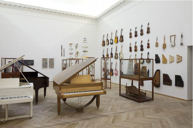
Ruth Ewan, installation view, Anders Sune Berg
Ruth Ewan
Arguably Ruth Ewan was the more successful exhibition, though by description you wouldn’t think it. By inviting people to deliver their unused or unwanted musical instruments to the museum for display, Ewan would put together an exhibition and event series designed to demonstrate the utopian power of music. Meh.
I missed the performance with these instruments last week, so I can’t speak to how well that went, but it turned out the arrangement of instruments in the main gallery was pretty great. Her success was achieved by playfully imposing the exhibition design of a natural history museum on a contemporary art show. A splayed bagpipe inside a wooden vitrine looks like a Damien Hirst vitrine project gone wonderfully wrong. In another enclosed pedestal, several accordions were wrapped around a red velour center as if the cultural bounty of a small country. The walls were the best; Neatly ordered harmonicas, keyboards, horns, guitars were pinned like specimens on display.
Ewan filled two other galleries with documentation of her events and her research leading up to the show. Both added to the show.

Michael Elmgreen & Igmar Dragset
ARKEN, All Together Now
This show was so bad it was upsetting. “All Together Now” is a show about community, and clearly put together by a curator with a checklist; art needed to be participatory, community-friendly, and made by famous artists. Got it.
Walking through the long banana-shaped exhibition space, a viewer can easily check off those boxes. Participation first; One of Dan Graham’s mirrored structures was included because people could walk inside the structure and see their friends outside of it. There’s nothing wrong with this of course, but when the curator marvels at every work that asks you to use it in some way, you begin to get suspicious. In another part of the museum we spent an enormous amount of time marveling at the wonders of what a garage door opener could do for a graffiti artist.
On the other end of this spectrum, Michael Elmgreen & Ingar Dragset produced a broken, unclimbable staircase to an administrative door, thus hindering interaction. “Our offices are actually behind that wall”, a curator told us dutifully. I never did find out how transformed she was by the experience of having door overtop of her head.
While that took care of the participation checkbox, we also had the museum-friendly artist checkbox. Dan Graham, Andres Serrano, Pascale Marthine Tayou, Marc Quinn, Elmgreen & Dragset, Antony Gormley, and Jeppe Hein all met that criteria. Too many of these artists were included for their names, not the quality of their work though, Serrano’s aesthetized image of a Ku Klux Klan member a perfect example. It’s an empty piece, but it depicts a demographic, thereby filling the community checkbox. The field is so big, merely existing would cross that item off the list.
Not that this should need to be said, but if good shows are about drawing out interesting connections between works—and I think they are—the checkbox approach to curating makes sure that never happens.
There are no highlights from this show.

{ 1 comment }
Nice! these types of communities are very helpful to show your paintings and arts. People can show their talent.
painting contractor
Comments on this entry are closed.