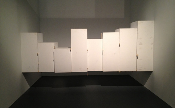
Virginia Overton, “Untitled (Pedestals)”, 2012, at The Kitchen. Image via tumblr user thetuesdayafter.
This week, another installment of our radical idea of telling people whether the art we saw was any good. As always, it’s a mixed bag; this week we looked at shows by Virginia Overton, Fred Sandback, Stan Douglas, Moyra Davey, Vibha Galhotra, Hans-Peter Feldmann, Douglas Huebler, Dan Walsh, and Ugo Rondione. Our comments, below.
Virginia Overton at The Kitchen
Paddy Johnson: My favorite piece in that show is one of the first you see; the long black diagonal pipe cuffed against the corners of that wall. It’s a little hard to defend that, seeing as how it’s just a pipe on the wall, but I like how forceful it is. It’s really very sexy.
Immediately visible is a bunch of pipes leaning against the wall and, in the center of the room, a hanging piece of 2 x 6, perfectly balanced by some bits of black wood and a light bulb at one end of the board. It’s a great demonstration of how much illusion can be drawn from balance. That wire suspending the piece is nowhere near its center and yet you don’t think about that for a second because it’s visually weighted perfectly.
Will Brand: I thought about that for a lot of seconds! It was a good work.
The thirty or forty pipes leaning against the wall, though, weren’t quite right. Their feet are pushing outwards against a very skinny looking chock, and while I’m sure that that—physically—involves a lot of force, I just didn’t feel it. I don’t think that’s a kind of kinetic force we’re used to thinking about. Maybe it would have worked better if it had been a few really big pipes, instead of a forest of little ones.
And then, in the back room, there was a loose wooden floor cobbled out of bits of variously-colored scrap wood that I just didn’t see anything in. It doesn’t really change the space beyond making you look at the floor, and the materials were more interesting when they were hanging from the ceiling, one room ago. I guess it served to make me aware that flooring isn’t exactly like the Empire ads.
The best piece in the show is definitely the wedge of plinths in the back corner, that holds itself up between two walls. It looks magical and has all the tension and material parsimony of Overton’s best work.
Corinna Kirsch: I think I called this a “fuck you” sculpture. I thought of it as being a fuck you to anyone who wanted to see the backside of the sculpture–you’d have to crawl underneath it, but then, who knows, the sculpture seems so precarious it could topple on you.
Yeah, [Untitled (pedestals)] was my favorite work in the show. Sure, there’s an element of magic—“How’d she get those eight pedestals to stay up there?”—but really, I think the dirt, and those wooden sticks shoved between each of the pedestals that kept them hovering in place, gets away from a sense of the otherworldly, planting you firmly back into the physical world.
Fred Sandback: Decades, at David Zwirner
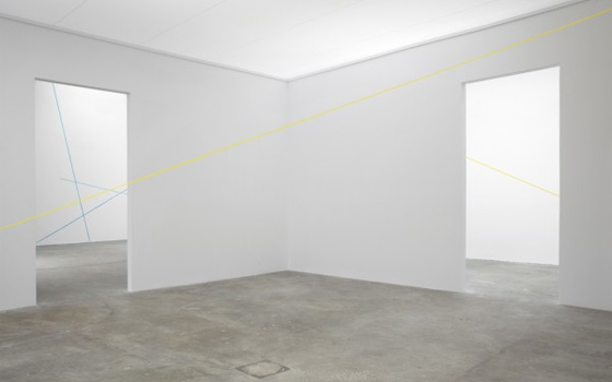
WB: Untitled (Vertical Two-part Corner Piece) (1968), the little black structure of wire and elastic that makes a half-box in the back right corner, blows away everything else here. It’s simple, it’s deceptive, it makes unseen volume apparent; it’s everything you want from Sandback. None of the other yarn pieces or drawings quite achieve the same effect.
The temporary rooms in the middle of the gallery are meant to be a reconstruction of Munich’s Galerie Heiner Friedrich, which Sandback apparently designed site-specific works for in the 1960s. My beef with that: I’m almost positive Galerie Heiner Friedrich didn’t have poured-concrete floors, and the poured-concrete floors at Zwirner really strangle at least one work in the show—16 Variations of 2 Diagonal Lines (1972), which would have looked much better against hardwood. I don’t think that’s a meaningless complaint; if you look at the Fred Sandback Archive, nearly every install shot from this period shows warm-looking wood floors. The Dia-run Sandback museum, while it existed, had wood floors. There’s a reason for that. Sandback’s minimalism doesn’t suit being around too much whiteness and other minimalism, because other minimalism ruins his punchline—which is roughly “oh shit there’s an invisible yellow box here”—by getting you thinking about space in terms of clean lines and invisible boxes already. By not going all the way, Zwirner made the show look worse than it was.
CK: My beef with this show was the materials. So, Sandback is supposed to be really good at slicing up architectural space with string, right? Well, at Zwirner, most of the works used fuzzy yarn. That big cross-section of the back gallery with one yellow string didn’t cause me to believe for a moment that anything was going on other than that a wooly thing was hanging there. The materials weren’t right for that purpose.
I’m pretty happy with Sandback’s smaller works, like that work Will mentions [Untitled (Vertical Two-part Corner Piece) (1968)]. There’s a lot of doubt here about what you’re seeing, how the work can stay up, whether it’s stuck to the wall, or if it’s worming its way into the wall. It’s a nice little work, and one that reminds you that good art forces you to do a lot of close looking.
PJ: Eh, I see what you’re saying about the fuzzy string, but I think it’s pulled taut enough that the few stray hairs don’t bother me all that much. The biggest issue to my mind is that there’s far too much work in this show. I mean, his only material is string. Lose a few walls and let those pieces breathe. I felt like I was at an art fair. [Note: The photos on David Zwirner’s site are too good to expose the actual problems with this show.]
Stan Douglas: Disco Angola at David Zwirner
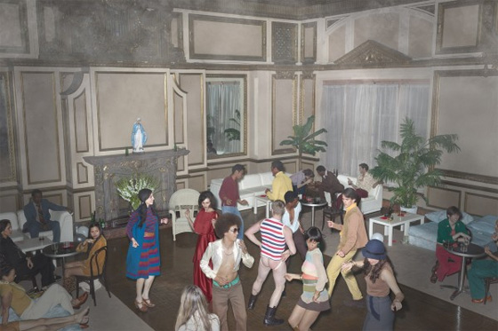
CK: I couldn’t get into this show. I don’t get the appeal of Stan Douglas’ performance (if I can even call it that) where he pretends to be a photojournalist who captured scenes of the drugged out, disco era in Angola and the States. What’s the purpose of making photography that looks like it was made in the 1970s, or showing that disco culture was a worldwide hit? It makes me think that we’re at a dead-end for photography if we’ve got to go back in time to find something interesting.
If you go, make sure to take a close look at the pantsless, dancing man. I’m pretty sure his right ass cheek is red from a spanking.
WB: My issue is that it doesn’t seem to be any different than his last show (which did the same thing as a 40s-era photographer) other than the addition of the Angolan Civil War as a big scary political topic that’s not actually addressed. This series doesn’t feel like it’s going anywhere. It looks good, though, and I’m sure it’ll sell.
PJ: Stan Douglas isn’t exactly a master of re-invention. He likes technology, he likes narrative structures, and he’s really interested in manufactured environments. He doesn’t stray much from these themes, which is fine with me, but he’s not particularly consistent as an artist. Douglas is an artist who’s proven very prone to investing in process at the expense of conceptual depth. “Inconsolable Memories”, his film chronicling protagonist Sergio Corrieri during the Cuban missile crisis, was the last piece I saw that I thought held real emotional resonance. That was back in 2005, so he’s got some work to do.
Moyra Davey at Murray Guy
PJ: What’s in the gallery: A series of black-and-white photographs of naked women who might be lesbians. Does having short hair and not wearing pants together mean you like women?
In another room, video projection in which Davey narrates a reflection on writing, the figure and photography. It’s the kind of video that’s best listened to repeatedly for comprehension, so um…
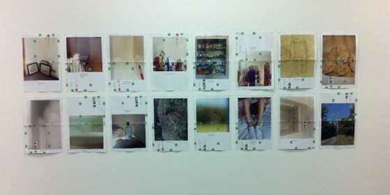
Also there were two suites of printed color photographs that were folded, taped and put in the mail.
WB: I gotta say, I don’t understand why the envelope pieces, which are both here and in the Whitney Biennial, were designed so as to not be fully visible in transit. They only work—by which I mean, are fully visible—when you unfold them, right? If they’re not gonna work while they’re in the mail, why put them in the mail at all? It’s not as though there’s any particular rhyme or reason—so far as I can tell—to which sections are chosen for the face of the envelope. What does the nice, design-y folding add that putting the photograph in a regular envelope would not? In an otherwise totally serious, very high-minded practice concerned with the nature of photography and so on, it feels like an unnecessary gimmick.
CK: I didn’t mind that the envelope pieces were folded up. What bothered me about them is that these letters, which featured a glossy magazine image with some text underneath, seemed like bland advertisements. The sayings included lines like, “What is said is often unremarkable.” Is she aiming at self-help?
PJ: I didn’t get that from the text at all. The work is hung in a grid and feels as though it’s meant to be read together. Each bit of text is printed on a label and then affixed to the print, as if it were an address or location itself. “All stories are somehow survival stories” is paired with a non-descript image of interior space, “Since interest in other people is also an interest in yourself” sits below a blurry objectless image. They don’t read as advertisements to me because I can’t identify what’s being sold.
I suspect there’s no great conceit behind putting these works in the mail past being conceived as mail art. Personally, I thought the folding and the regularly spaced green bits of tape added to the images; in the context of the text, the paper began to look wounded for me, with the tape as band-aids.
Vibha Galhotra at Jack Shainman
PJ: Worst show we saw and by a long shot. Vibha Galhotra makes cliche pictorial wall hangings and objects from tiny bells. Yoan Capote makes cliche pictorial wall hangings from fish hooks. They both show at Shainman. How can one dealer show so much bad art and still represent Michael Snow?
CK: If you want to see a huge hanging snake-like sculpture that rips off Eva Hesse, go to this show.
WB: Ew.
Hans-Peter Feldmann at 303 Gallery
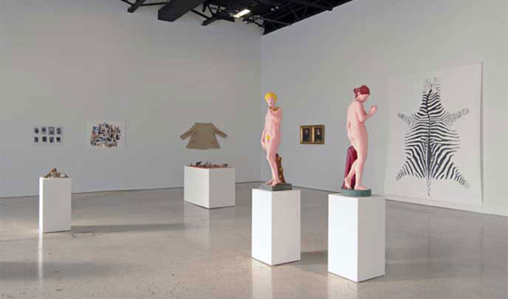
CK: Feldmann put a lot of objects in the room (animals toys on a rug, shoes with tacks in the soles, and some crappily painted Adam and Eve sculptures), but he doesn’t give us a clue as to how the objects should relate to each other. If there’s a structure here, or some sort of narrative, it’s a vague one. Also, the objects he makes aren’t that novel: Feldmann’s shoes with tacks are just an update on Man Ray’s iron with nails.
PJ: He has to know that shoe with tacks has been done a million times right? I mean, he’s a good artist who’s been working for a long time and entire show is kitsch. There’s something funny about all those painted statues — Eve’s pubic hair is just one solid brush stroke — but it amounts to nothing. That’s a real letdown considering his portrait series “100 years”, made up of 101 photographic portraits of people ages 8 months to 100 years, is one of my favorite photographic works to date.
WB: Yeah, this show is at a neither-here-nor-there level of irony. He has to know the shoe is corny, and I understand that he has to know that the shoe is corny, but the shoe’s still corny, and it doesn’t gain anything by me giving him the benefit of the doubt.
“the spirit level” at Gladstone Gallery, 21st Street
PJ: I’m not buying anything in this gallery, and I don’t know that I ever have. The shows in this space always look ridiculously ornate. In this case, a defence might be made for the Peter Buggenhout’s giant metal sculptures, but it’s slight. They look like they’ve been stored in a barn for 50 years, so they seem fairly menacing. Still, who cares. They’re just nondescript hunks of assemblaged metal.
CK: I didn’t know that Ugo Rondione was a curator, in addition to being an artist. From seeing his show at Gladstone, I take it that he needs to work on editing some of his ideas: even if there’s some idea that the spiritual has a place in contemporary art, there’s no evenness between the works on the upper and lower levels. The first floor was filled with some plop art, the type that could crush you. I guess the most memorable works were Peter Buggenhout’s dusty, trash sculptures. [Of course, Gladstone’s a great place to see gigantic, crushed up stuff (like the busted cars at Matthew Barney’s show last year).] They’re bigger than any John Chamberlains I’ve ever seen, but unlike Chamberlains, I didn’t want to peek inside of the crushed up crevices. I think they’d look better on a movie set for some apocalyptic action film.
Dan Walsh at Paula Cooper
CK: Well, I thought I’d seen all the different ways to show how paintings are composed on a grid–until I saw Dan Walsh’s “hot dog” paintings. I like that he made a system that shows evidence of the grid, even if it’s based on shapes that look like hot dogs. It’s not a perfect show: Walsh isn’t the best colorist. And I’m not sure why some of the paintings were hung so low.
PJ: It was only the paintings on the far wall, facing the entrance, that were hung low, and personally, I love that kind of install. It demands more of the work, and I think those two paintings could handle it.
Dan Walsh gets an A for masochism in this show, and that’s a good thing. Each painting builds up layers of paint and informs his subsequent mark making. It’s meticulous work only a small percentage of us are cut out for. Most of the images surfaces are heavily worked which isn’t obvious from reproductions. To my mind, the strongest work in the show was that hot dog painting—it seemed almost playful. With work that’s so detail oriented, it’s easy for them to seem a little tedious. Just one hot dog painting solves that problem.
WB: The masochist mark-making was infectious; I wanted to mime out each brushstroke, just to prove to myself how difficult they must have been. These are great works up close. At a distance, the factors Corinna points out start to play a bigger role: the detail in some paintings disappears, so you just end up with a nice, mostly undifferentiated field of blue. I probably wouldn’t be complaining about that if Paula Cooper’s space weren’t so cavernous, though.
Douglas Huebler: Crocodile Tears at Paula Cooper
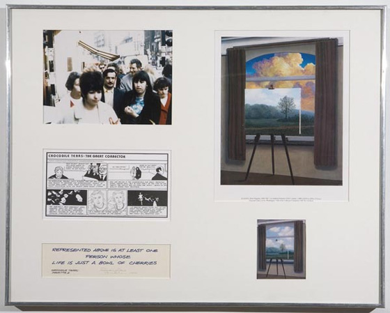
CK: This was a great show to end on. Really, Huebler’s humor is first-rate, like a lot of other conceptual artists I admire. I guess that has something to do with how much of conceptual practice relies on wordplay. So, the show itself presented snippets of a screenplay written by Huebler in the late 1970s and early 1980s. It’s a farce about the art world, its dealers, artists, and academics, that still seems sharp and relevant today. In the gallery, the screenplay was surrounded by paintings and comic strips [which appeared in installments in the L.A. Weekly (1984);] that illustrated or alluded to the screenplay. They’re paired with paintings—crude, but appealing reproductions of well-known artists, like Mondrian.
I’m not sure if I buy into the idea that the screenplay was ever supposed to be produced: the scenes are pretty short—one’s about an artist hack who makes quick portraits, another’s about an artist who’s more interested in another artist’s wife. There’s only a handful of scenes that repeat throughout the gallery, too.
WB: If you saw Amelie von Wulffen’s show at Greene Naftali last summer, it was very similar; roughly half the space was given over to her life in the art world, the comic. By comparison, this work is punchier, more exciting, and better-suited to its form—von Wulffen’s work felt like it had been adapted to comics, rather than written with comics in mind—despite being nearly thirty years old. That’s great. The series of photographs with captions like “Pictured above is at least one person who is always fixing their house” were fun, too, even if they were boring as images; the captions are tiny poems in their own right, really, and they get at the point of language’s effect on vision without copping out on the language side.
PJ: I know apathy isn’t supposed to be any kind of guiding force for a critic, but I deeply don’t care about this show. I didn’t get all the jokes, and the ones I did I didn’t think were that funny. Even the Cagean project that sparked the comics—a project to “photographically document the existence of everyone alive”—isn’t one I care for. The impossibility of a given task doesn’t necessarily lead artists to unexpected places. This is a pretty good example of that.



{ 1 comment }
You guys are awesome! These reviews make me happy.
Comments on this entry are closed.