
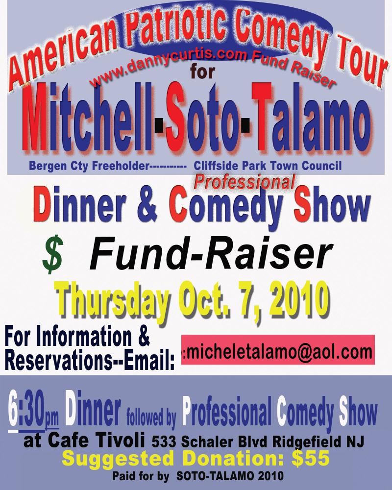
Dear Rachel Harrison,
I know you typically use posters with a little less font variation in your work, but somehow the poster design for this Tea Party seemed like something you might like. In particular pay attention to the treatment of capital letters, shadowboxing, and placement of the word professional.
Sincerely,
Art Fag City
PS Link tip: Mecredis

{ 7 comments }
that’s the most awesomest flier i’ve ever seen….
At risk of exposing how outside the loop I am… why is this addressed to Rachel Harrison?
I think that was a typo on Paddy’s part she meant to write “An open letter to Jorge Pardo” -did he get that MacArthur Grant because of his sexuality or his ethnicity? I guess with friends in high places we can only guess.
Or maybe we should ask an art critic but that will take at least 3 weeks for an answer while they “poll the averages” on Facebook seeking a consensus.
Or we could ask a NY Times critic-you know I have to say “greatest” and “boundless talent” several times in my review of Rob’s show so Gavin still invites me to his parties.
Did you hear Gavin is closing his gallery to create a perpetual exhibit of Rob’s show like the Dia’s “Broken Kilometer” and the “Earth Room”-its called Perpetual Degradation.
just take heart that most people get through what truly is a very difficult time in life – Freshman Year
“professional” comedy show
A typographic NIGHTMARE. Stretched type and bad shadows/glows.
You’re writing about right things. Many thanks you for useful post. Every time it needs to be wise in planning, investing, so use home insurance company ratings or you may save on another type of auto protection and auto insurance comparison.
Comments on this entry are closed.