
POST BY KAREN ARCHEY
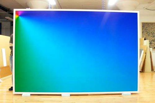
“Photoshop CS: 72 by 110 inches, 300 DPI, RGB, square pixels, default gradient “Spectrum”, mousedown y=1416 x=1000, mouseup y=208 x=42,” 2008, unique c-print, 75 x 113 inches. In the back room at the New Museum, image, found on Cory Arcangel’s site, brings to mind the work of Louise Lawler.
Editors note: Art Fag City Plus is a column in which staff respond to art world news, reviews and gossip.
Are Cory Arcangel's new gradients a significant departure from his previous work? Shown at the New Museum's Younger Than Jesus exhibition, the artist's new large scale prints garnered a few pans amidst broader reviews of the exhibition. Granted, the total number of sentences about his specific work wouldn't reach double digits, but unlike many artists in the show we've repeatedly heard that Arcangel's gradients are out of step and poorly considered.
Produced in one mouse click, the large high-quality chromogenic prints are simple manifestations of a pre-fab gradient tool in Photoshop. The titles provide all of the file's data needed for their creation, and act as a DIY manual for prospective viewers. Not that any of this information did much to convince critics. New York Magazine's Jerry Saltz described the work as a “decorative one-liner,” while Howard Halle at Time Out New York believes the artist spotlighted his artistic privilege by getting something as easy as a digital readymade into a major museum.
But given the quality of the artist's earlier production, I remained skeptical that the work was quite so vacant. Hoping I might make sense of the gradients and their criticism, I attended Arcangel's Public Art Fund lecture/g-chat session with his sister Jamie at the New School's Tishman Auditorium. Though they were not discussed at length during the presentation, I asked him later about their departure from his earlier work which seemed far less commercially based. There is no a shift in content, he told me, just a change in physical production. From here he went on to describe a concept he's known to have long created work about: the ephemerality of technology and our cultural obsession with the new. The qualities of greatest interest to the artist were the very threads critics failed to consider, their quick and poor aging, and likelihood of irrelevance in years to come.
Rather than creating a piece typical of his previous work — one that would continue to straddle the realms of net-based and plastic art — Arcangel wanted to make an object specific to exhibition in a gallery setting. Almost as though relieved the artist spoke about how he was “finally able” to create this type of art. Could this desire — accounting for the artist's confusing shift in production — come from fatigue from balancing those two worlds? We know it's rare for net artists to make physical objects that are exhibited in the contemporary art world. Arguably, Arcangel's gradient prints challenge the boundaries between net and “gallery specific” art within this milieu. Although, it may lean too far toward the plastic side too early in the game, the artist's new work surely isn't worth a quick dismissal.

{ 71 comments }
To me, this work is a comment on the current accessible and disposable nature of art.
What used to take years of study and technique now only takes a few clicks. Art in the age of default settings.
To me, this work is a comment on the current accessible and disposable nature of art.
What used to take years of study and technique now only takes a few clicks. Art in the age of default settings.
To me, this work is a comment on the current accessible and disposable nature of art.
What used to take years of study and technique now only takes a few clicks. Art in the age of default settings.
Interesting point, but I’d argue that it takes years of study — formally at an institution or experientially within the art world — to be able to create this work. I believe Arcangel takes the work’s conditions of possibility as part of its content. These conditions would include current technologies and, maybe less intentionally, his position in the art world.
Interesting point, but I’d argue that it takes years of study — formally at an institution or experientially within the art world — to be able to create this work. I believe Arcangel takes the work’s conditions of possibility as part of its content. These conditions would include current technologies and, maybe less intentionally, his position in the art world.
If he wanted to time stamp the work as 2009 (“new”) and then watch it crumble, surely the Photoshop gradient tool – identical in all it’s respects since the 90s – doesn’t do that?
If he wanted to time stamp the work as 2009 (“new”) and then watch it crumble, surely the Photoshop gradient tool – identical in all it’s respects since the 90s – doesn’t do that?
ditto with the c-print. I’m not sure how temporality and degradation are any different for a print or a platform-, format-, or hardware-dependent digital work. nnIf that’s Cory’s point, then he may have found a potentially marketable way into the object-oriented art world. Unfortunately, he’d also find that those object critiques have been exhaustively examined.
ditto with the c-print. I’m not sure how temporality and degradation are any different for a print or a platform-, format-, or hardware-dependent digital work. nnIf that’s Cory’s point, then he may have found a potentially marketable way into the object-oriented art world. Unfortunately, he’d also find that those object critiques have been exhaustively examined.
ditto with the c-print. I’m not sure how temporality and degradation are any different for a print or a platform-, format-, or hardware-dependent digital work. \n\nIf that’s Cory’s point, then he may have found a potentially marketable way into the object-oriented art world. Unfortunately, he’d also find that those object critiques have been exhaustively examined.
It just feels empty and lacks creativity. We shouldn’t have to know the context of his body of work to validate it.
It just feels empty and lacks creativity. We shouldn’t have to know the context of his body of work to validate it.
It just feels empty and lacks creativity. We shouldn’t have to know the context of his body of work to validate it.
It just feels empty and lacks creativity. We shouldn’t have to know the context of his body of work to validate it.
It just feels empty and lacks creativity. We shouldn’t have to know the context of his body of work to validate it.
Best work he’s made yet, all points made by the critics are exactly the point -period.
Best work he’s made yet, all points made by the critics are exactly the point -period.
Best work he’s made yet, all points made by the critics are exactly the point -period.
Best work he’s made yet, all points made by the critics are exactly the point -period.
Best work he’s made yet, all points made by the critics are exactly the point -period.
you didnt make the case for this piece at all paddy
you didnt make the case for this piece at all paddy
you didnt make the case for this piece at all paddy
you didnt make the case for this piece at all paddy
Just so it’s clear, as indicated at the top of this post, the piece was written by Karen Archey.
Just so it’s clear, as indicated at the top of this post, the piece was written by Karen Archey.
Just so it’s clear, as indicated at the top of this post, the piece was written by Karen Archey.
Just so it’s clear, as indicated at the top of this post, the piece was written by Karen Archey.
The first work I saw of Arcangel’s, in 2002, was a group of silkscreen prints of the 8-Bit art he was making at the time. (A TV was nearby displaying a Nintendo cartridge hack he did with Paul Davis/BEIGE). That was some of his earliest exhibited work in New York. So this idea that he is somehow a net artist “making his way into the object-oriented art world” in 2009 is just not accurate. He was making objects about “easy” technological processes from the get-go, the question is whether Photoshop “done straight” is as good or interesting as the 8-Bit work.
The first work I saw of Arcangel’s, in 2002, was a group of silkscreen prints of the 8-Bit art he was making at the time. (A TV was nearby displaying a Nintendo cartridge hack he did with Paul Davis/BEIGE). That was some of his earliest exhibited work in New York. So this idea that he is somehow a net artist “making his way into the object-oriented art world” in 2009 is just not accurate. He was making objects about “easy” technological processes from the get-go, the question is whether Photoshop “done straight” is as good or interesting as the 8-Bit work.
The first work I saw of Arcangel’s, in 2002, was a group of silkscreen prints of the 8-Bit art he was making at the time. (A TV was nearby displaying a Nintendo cartridge hack he did with Paul Davis/BEIGE). That was some of his earliest exhibited work in New York. So this idea that he is somehow a net artist “making his way into the object-oriented art world” in 2009 is just not accurate. He was making objects about “easy” technological processes from the get-go, the question is whether Photoshop “done straight” is as good or interesting as the 8-Bit work.
If this particular work doesn’t satisfy as much as his earlier works, perhaps its because the “gradient tool” isn’t as embedded in our cultural memory as old nintendo video games. But it still belongs within the family of works presenting defamiliarized (ie hacked) versions of 80s and 90s technology.
But I think the main thing informing this work is something he said in a talk I recently watched on youtube where, talking about future work, he wants to do “as little as possible”. One can debate the merits of that strategy but I think this accomplishes that goal superbly (point, click, send to printer).
@Tom et al: I would contextualize this work within the lineage of dirtstyle design; digital aesthetics aging poorly. Clearly those initial concepts were very influential, even if they aren’t that relevant any more. The likelihood of these pieces being as important seems slim of course – it’s a very conservative looking piece in the face of a lot of unmonumental production — but I kind of like it for that. In its own way it seems just as out of step with “valued” aesthetics as dirt style did.
To my recollection Cory/Paul B. Davis began with the eight bit construction set, which isn’t net art, but also isn’t object oriented work. You are right to point out however that he did not begin as a net artist, as Karen’s piece suggests.
My understanding was Arcangel/Davis/Beuckmann/Bonn were a collective (BEIGE) working in many media, not just making records, although it’s true their 1999-2001 website posts are more about gigs than shows. The first BEIGE show at Team Gallery in mid-2003 had objects (ascii art, inkjet photos, bead work, etc) in addition to the 8 Bit Construction Set record on a turntable. Here is some documentation of a BEIGE show from four years ago with objects, including Arcangel’s work and some Paul Davis prints–http://www.space1026.com/space.php?action=event_detail&t=607&showID=106 –made with a “default” image editing software. I was always intrigued by these and asked Davis about them. He said he downloaded the image software in the ’90s and that it could generate “crappy 3d wireframe fractal landscapes.” It’s interesting to me that the 2005 show looks so “slacker” and now you’re describing Arcangel’s edge as being the conservative in a show full of slackers.
My understanding was Arcangel/Davis/Beuckmann/Bonn were a collective (BEIGE) working in many media, not just making records, although it’s true their 1999-2001 website posts are more about gigs than shows. The first BEIGE show at Team Gallery in mid-2003 had objects (ascii art, inkjet photos, bead work, etc) in addition to the 8 Bit Construction Set record on a turntable. Here is some documentation of a BEIGE show from four years ago with objects, including Arcangel’s work and some Paul Davis prints–http://www.space1026.com/space.php?action=event_detail&t=607&showID=106 –made with a “default” image editing software. I was always intrigued by these and asked Davis about them. He said he downloaded the image software in the ’90s and that it could generate “crappy 3d wireframe fractal landscapes.” It’s interesting to me that the 2005 show looks so “slacker” and now you’re describing Arcangel’s edge as being the conservative in a show full of slackers.
My understanding was Arcangel/Davis/Beuckmann/Bonn were a collective (BEIGE) working in many media, not just making records, although it’s true their 1999-2001 website posts are more about gigs than shows. The first BEIGE show at Team Gallery in mid-2003 had objects (ascii art, inkjet photos, bead work, etc) in addition to the 8 Bit Construction Set record on a turntable. Here is some documentation of a BEIGE show from four years ago with objects, including Arcangel’s work and some Paul Davis prints–http://www.space1026.com/space.php?action=event_detail&t=607&showID=106 –made with a “default” image editing software. I was always intrigued by these and asked Davis about them. He said he downloaded the image software in the ’90s and that it could generate “crappy 3d wireframe fractal landscapes.” It’s interesting to me that the 2005 show looks so “slacker” and now you’re describing Arcangel’s edge as being the conservative in a show full of slackers.
My understanding was Arcangel/Davis/Beuckmann/Bonn were a collective (BEIGE) working in many media, not just making records, although it’s true their 1999-2001 website posts are more about gigs than shows. The first BEIGE show at Team Gallery in mid-2003 had objects (ascii art, inkjet photos, bead work, etc) in addition to the 8 Bit Construction Set record on a turntable. Here is some documentation of a BEIGE show from four years ago with objects, including Arcangel’s work and some Paul Davis prints–http://www.space1026.com/space.php?action=event_detail&t=607&showID=106 –made with a “default” image editing software. I was always intrigued by these and asked Davis about them. He said he downloaded the image software in the ’90s and that it could generate “crappy 3d wireframe fractal landscapes.” It’s interesting to me that the 2005 show looks so “slacker” and now you’re describing Arcangel’s edge as being the conservative in a show full of slackers.
My understanding was Arcangel/Davis/Beuckmann/Bonn were a collective (BEIGE) working in many media, not just making records, although it’s true their 1999-2001 website posts are more about gigs than shows. The first BEIGE show at Team Gallery in mid-2003 had objects (ascii art, inkjet photos, bead work, etc) in addition to the 8 Bit Construction Set record on a turntable. Here is some documentation of a BEIGE show from four years ago with objects, including Arcangel’s work and some Paul Davis prints–http://www.space1026.com/space.php?action=event_detail&t=607&showID=106 –made with a “default” image editing software. I was always intrigued by these and asked Davis about them. He said he downloaded the image software in the ’90s and that it could generate “crappy 3d wireframe fractal landscapes.” It’s interesting to me that the 2005 show looks so “slacker” and now you’re describing Arcangel’s edge as being the conservative in a show full of slackers.
The 8 Bit Construction Set had the software they used to make the music represented physically in cut vinyl.
I love that gradient piece of Cory’s, such a smart, simple gesture. But what about the previous gradient works (with smudges), or do you guys only comment on what’s been shown in NY? ;oP
http://andorgallery.com/shows/images/17_2008b.jpg
There are a bunch more gradient/smudge pieces that were shown in Europe. I think it’s important to consider that the smudge tool was dropped for this particular piece.
greg.org – Temporality and degradation are themes I see running through the artist’s work, and not specific to the c-print.
Rebecca – Doesn’t knowing the history of an artist’s work enrichen your aesthetic experience?
Tom – I don’t think it’s a contestable point that there’s a huge separation between the new media/net art worlds and the contemporary art world proper. Also, I’m not as concerned with how Arcangel began his practice, but rather how it’s popularly understood to be. This work is of particular interest because of its placement in the museum setting and its high level of public exposure.
Mark – I have to agree with you about the photoshop gradient being less ingrained in our cultural consciousness – very insightful point. Honestly, I generally enjoy work that employs an obvious lack of labor as it ignites so many arguments. (i.e. Richard Tuttle, Joe Bradley, etc.) Perhaps it’s located in our desire to make sense of success in the face of our own failures.
Karen, how an artist’s practice is popularly understood starts with critics understanding it and explaining it correctly. My point is Arcangel has been showing work in galleries, museums, etc for most of his career. You are trying to explain the Photoshop gradient as some kind of late accommodation to gallery practice and that’s not true. Its expense relative to the old work, and the artist’s current “position in the art world” may be content, but it’s not much to talk about.
Karen, how an artist’s practice is popularly understood starts with critics understanding it and explaining it correctly. My point is Arcangel has been showing work in galleries, museums, etc for most of his career. You are trying to explain the Photoshop gradient as some kind of late accommodation to gallery practice and that’s not true. Its expense relative to the old work, and the artist’s current “position in the art world” may be content, but it’s not much to talk about.
Karen, how an artist’s practice is popularly understood starts with critics understanding it and explaining it correctly. My point is Arcangel has been showing work in galleries, museums, etc for most of his career. You are trying to explain the Photoshop gradient as some kind of late accommodation to gallery practice and that’s not true. Its expense relative to the old work, and the artist’s current “position in the art world” may be content, but it’s not much to talk about.
Karen, how an artist’s practice is popularly understood starts with critics understanding it and explaining it correctly. My point is Arcangel has been showing work in galleries, museums, etc for most of his career. You are trying to explain the Photoshop gradient as some kind of late accommodation to gallery practice and that’s not true. Its expense relative to the old work, and the artist’s current “position in the art world” may be content, but it’s not much to talk about.
Many of Cory’s talks and projects, as of late, deal with the “amateur” and “sub-amateur” artist. Now days, anyone can create a work of art on Photoshop that, 50 years ago, would have been considered of great quality and technique. A piece that would’ve taken an artist a long time to create in the past, can now be created with 1 click of the mouse.nnModern technology gives us all the ability to easily create seemingly technical art with absolutely no formal training or technique (Photoshop, GarageBand, animated web cam graphics, etc…). I feel this piece is a direct reference to that concept. Again, art in the age of default settings.nnIs art without technique or training disposable? Is it good? Up to discussion…
Many of Cory’s talks and projects, as of late, deal with the “amateur” and “sub-amateur” artist. Now days, anyone can create a work of art on Photoshop that, 50 years ago, would have been considered of great quality and technique. A piece that would’ve taken an artist a long time to create in the past, can now be created with 1 click of the mouse.nnModern technology gives us all the ability to easily create seemingly technical art with absolutely no formal training or technique (Photoshop, GarageBand, animated web cam graphics, etc…). I feel this piece is a direct reference to that concept. Again, art in the age of default settings.nnIs art without technique or training disposable? Is it good? Up to discussion…
Many of Cory’s talks and projects, as of late, deal with the “amateur” and “sub-amateur” artist. Now days, anyone can create a work of art on Photoshop that, 50 years ago, would have been considered of great quality and technique. A piece that would’ve taken an artist a long time to create in the past, can now be created with 1 click of the mouse.nnModern technology gives us all the ability to easily create seemingly technical art with absolutely no formal training or technique (Photoshop, GarageBand, animated web cam graphics, etc…). I feel this piece is a direct reference to that concept. Again, art in the age of default settings.nnIs art without technique or training disposable? Is it good? Up to discussion…
Many of Cory’s talks and projects, as of late, deal with the “amateur” and “sub-amateur” artist. Now days, anyone can create a work of art on Photoshop that, 50 years ago, would have been considered of great quality and technique. A piece that would’ve taken an artist a long time to create in the past, can now be created with 1 click of the mouse.nnModern technology gives us all the ability to easily create seemingly technical art with absolutely no formal training or technique (Photoshop, GarageBand, animated web cam graphics, etc…). I feel this piece is a direct reference to that concept. Again, art in the age of default settings.nnIs art without technique or training disposable? Is it good? Up to discussion…
Many of Cory’s talks and projects, as of late, deal with the “amateur” and “sub-amateur” artist. Now days, anyone can create a work of art on Photoshop that, 50 years ago, would have been considered of great quality and technique. A piece that would’ve taken an artist a long time to create in the past, can now be created with 1 click of the mouse.nnModern technology gives us all the ability to easily create seemingly technical art with absolutely no formal training or technique (Photoshop, GarageBand, animated web cam graphics, etc…). I feel this piece is a direct reference to that concept. Again, art in the age of default settings.nnIs art without technique or training disposable? Is it good? Up to discussion…
Many of Cory’s talks and projects, as of late, deal with the “amateur” and “sub-amateur” artist. Now days, anyone can create a work of art on Photoshop that, 50 years ago, would have been considered of great quality and technique. A piece that would’ve taken an artist a long time to create in the past, can now be created with 1 click of the mouse.\n\nModern technology gives us all the ability to easily create seemingly technical art with absolutely no formal training or technique (Photoshop, GarageBand, animated web cam graphics, etc…). I feel this piece is a direct reference to that concept. Again, art in the age of default settings.\n\nIs art without technique or training disposable? Is it good? Up to discussion…
Afterthought re: “work that employs an obvious lack of labor as it ignites so many arguments. (i.e. Richard Tuttle, Joe Bradley, etc.)” Tuttle’s work in the ’70s offended some with its slight means but it wasn’t about starting fights, it was about the size of an object relative to the space it engages, among other things. The work that Arcangel and Bradley are showing now isn’t the work that got them into museums–rather, it is their so-called sophomore work, which fans and non-fans alike are struggling to evaluate. Arcangel/BEIGE’s “Nintendo Clouds” didn’t start fights, everybody pretty much loved it from Day One. Offending with something slight and home-made is completely different from offending with a large framed print that obviously took some capital to produce.
Afterthought re: “work that employs an obvious lack of labor as it ignites so many arguments. (i.e. Richard Tuttle, Joe Bradley, etc.)” Tuttle’s work in the ’70s offended some with its slight means but it wasn’t about starting fights, it was about the size of an object relative to the space it engages, among other things. The work that Arcangel and Bradley are showing now isn’t the work that got them into museums–rather, it is their so-called sophomore work, which fans and non-fans alike are struggling to evaluate. Arcangel/BEIGE’s “Nintendo Clouds” didn’t start fights, everybody pretty much loved it from Day One. Offending with something slight and home-made is completely different from offending with a large framed print that obviously took some capital to produce.
Afterthought re: “work that employs an obvious lack of labor as it ignites so many arguments. (i.e. Richard Tuttle, Joe Bradley, etc.)” Tuttle’s work in the ’70s offended some with its slight means but it wasn’t about starting fights, it was about the size of an object relative to the space it engages, among other things. The work that Arcangel and Bradley are showing now isn’t the work that got them into museums–rather, it is their so-called sophomore work, which fans and non-fans alike are struggling to evaluate. Arcangel/BEIGE’s “Nintendo Clouds” didn’t start fights, everybody pretty much loved it from Day One. Offending with something slight and home-made is completely different from offending with a large framed print that obviously took some capital to produce.
Afterthought re: “work that employs an obvious lack of labor as it ignites so many arguments. (i.e. Richard Tuttle, Joe Bradley, etc.)” Tuttle’s work in the ’70s offended some with its slight means but it wasn’t about starting fights, it was about the size of an object relative to the space it engages, among other things. The work that Arcangel and Bradley are showing now isn’t the work that got them into museums–rather, it is their so-called sophomore work, which fans and non-fans alike are struggling to evaluate. Arcangel/BEIGE’s “Nintendo Clouds” didn’t start fights, everybody pretty much loved it from Day One. Offending with something slight and home-made is completely different from offending with a large framed print that obviously took some capital to produce.
Its kind of funny to read these comments about Cory Arcangel “New Light on Gradient Works”.
There is nothing new about these paintings. Photoshop is used by thousands of designers for many many years and there is zilions gradiens artwork produced and Arcangel is just an artist who needs to eat and pay bills like any other artist. If he could discover photoshop 10 years ago maybe there would be no mario clouds an other things that just does not sell.
So what kind of speculation can be here. Art can be anything and it can be made by anyone with hands or computer as long as it visually interesting.
I bet he realized this when he sold one otherwise why he would make another similar piece that he already did. So I predict that the next thing that Arcangel is going to be doing learning photoshop 🙂 because there is a lot of more default effect to show to art world.
@Tomas Photoshop did exist 10 years ago. If you’re wondering why the artist decided to make these works, attend one of his lectures and ask him rather than speculate here.
@Tomas Photoshop did exist 10 years ago. If you’re wondering why the artist decided to make these works, attend one of his lectures and ask him rather than speculate here.
@Tomas Photoshop did exist 10 years ago. If you’re wondering why the artist decided to make these works, attend one of his lectures and ask him rather than speculate here.
Tom – Apologies for the belated reply, Hrag’s post prompted me to respond to you.
While I’m glad you offered a historical grounding to the gradient prints, I’d argue that it’s difficult to deconstruct this work on an entirely factual basis. Given a.) the wide variations in interpretation from reputable critics and b.) the aesthetic “openness†of the work, it seems obvious that a consensus on anything but its historical framework would be difficult, if not impossible at all. Of course it’s necessary for critics and other specialists to deconstruct work “correctly,†but it seems like we need to reevaluate what “correct†means. I also think it’s the responsibility of the critic to promote open discourse rather than channeling a combative attitude.
Comments on this entry are closed.