
In an attempt for year end closure, this post covers the few outstanding art related exhibitions and publications in my cue. The premise of this piece probably appears a kin to DVD extras, but having a personal relationship to each write up, naturally I tend to regard them differently. In most cases the pieces that have longer lead times (re: remain drafts for long periods of time) are the result of having more to say on the subject than I can work out in the free time that I have. Providing these short write-ups is less than these works deserve, but preferable to the alternative; no post.
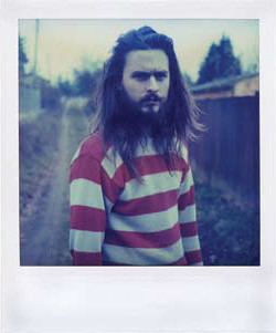
Mike Broady, from The Tones of Dirt and Bone,
Image via These Birds Walk Proudly
These Birds Walk Proudly
Publisher and artist Paul Schiek contacted me in December about the Kin Subscription Series, a series four books each representing a different artist. Made up entirely of polaroid images, and hand held in size The Tones of Dirt and Bone, by photographer Mike Brody, constitutes the first in this series. The work superficially feels slightly hipsterish in nature, but it doesn’t take much to realize that they have a gritty sophistication that can not be lumped into the trend. Schiek’s series draws connections between Brody, his own work and emerging photographers Ari Marcopoulos and Jim Goldberg, all of whom capture the preciousness and personal beauty within the malaise of the 20 something lifestyle. Frankly, I think $75 dollars of a limited edition series of four books, is something of a steel. It’s only available online here.
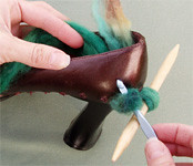
Image via Craft
Craft
Hipster knitting projects aren’t necessarily at the top of my list of things I want to cover, and yet, I have to say I genuinely enjoy Make’s newest partner publication. I suppose part of this has to do with the fact that I’ve always wanted a pair of functional AND fashionable knitted boots, and the first issue of the magazine shows you how to do this. The only thing the magazine hasn’t solved is my inability to follow instructions properly. Of course, the likelihood of anyone solving that problem would be on par with creating world peace.

Paul McCarthy, PotHead, 2002, Silicone, 33.5 x 42 x 48 inches
Image via Museum of Contemporary Art San Diego
The Rubell Family Collection, Miami, Red Eye
I’ve got three paragraphs and about 5 million pictures on a borrowed computer in Miami on this collection and there it stays. I suppose one of the benefits of not having posted on the exhibition lies in the fact that I have had time to reflect on it. On the flip side, I’m not sure I can call my memories “fresh” anymore.
Another benefit of having waited so long to express my thoughts is that there are now plenty of published opinions to respond to on the subject. The exhibition received a wide range of reactions ranging from Peter Schjeldahl’s best in show praise, explaining that it “posits a blooming tradition of gorgeous and impolite styles keyed to psychosocial provocations…”, where as Tyler Green took a radically different stance calling it “an atrocious show that said far more about the collectors (and their plenty-apparent lack of taste.)” I found my own reaction to be somewhere in the middle of these two poles. Some of the “older” (a relative term to be sure, since some of these works were done in 2002) works in their collection were really strong, in particular a Paul McCarthy brown rubber dildo explosion similar to PotHead. I can’t think of a piece that better captures the abject and excess of sex and culture while blurring material and sexual fetish. On the other hand, there seemed to be plenty of art in the show, for example the sculptures of Jason Meadow that felt like reiterations of work that already exists, or Thomas Houseago’s contortionist skins that have only the fact that there are a lot of them going for them, that left much to be desired.
Though critics covered the thematic interests of these artists fairly well, the aspect of comparable collections went largely untouched (the Times ran an article here), which surprises me since it’s not like the Rubell’s are the only family in history to exhibit their holdings. In that respect, the Ydessa Hendeles Art Foundation in Toronto first comes to mind, which though radically different in public approach, touches on some of the same themes of excess and sexuality. I recall a group exhibition launched circa 1996 at the Hendeles Foundation in particular that included the work of photographer and scultor Sarah Lucas and (the obnoxious) Tony Oursler, and in retrospect seems to be the 90’s incarnation of the Rubell’s Red Eye. The importance of collection comparing may seem a little unclear, but given the recent talk of collectors gaining sway in the arena of taste making, it makes sense to follow a few of these high profile collections, and watch what happens over the next couple of years. If father and son goat fucking becomes fashionable (another Paul McCarthy work in the exhibit) I guess we’ll know the theory holds water.
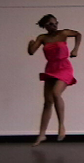
Image via Regina Rocke
Regina Rocke
An artist you may not have heard of because she travels primarily in dance circles, I promised both myself and Regina I would discuss her work at great length. I suppose if you define “great length” as 200 words, I will have full filled that promise. The extraordinariness of Rocke’s work lies her ability to take cliche material from both high and low culture and bring meaning to it. For example, she uses the tired method of reading aloud artist writings such as those by Coco Fusco, she speaks and moves with “purpose”, and she booty dances to the beat of a popular dance tune. Regina Rocke mixes a variety of performance crap I would never want to see into something I could watch almost indefinitely.

Eye On Europe (closed January 1 2007)
Eye On Europe received a surprisingly small amount of coverage from the press given the quality of the exhibition. Who knows why this happened, perhaps people had seen enough Dieter Roth what with his giant retrospective two and a half years ago at MoMA and PS1, but it’s not like he made up the whole show. Paper fetishists all over the world had plenty to celebrate with this exhibition, as detailed wallpaper by Sarah Lucas, Peter Kogler, and Damien Hirst, stood out in the first half of the exhibition, and the number of prints and books by European artists by Hanne Darboven, Mangelo etc on the sixth floor, could leave a viewer with very little time to do anything else if they were to carefully look at each work. For my tastes, I found there to be more material than I could absorb, and would have enjoyed a little more editing, but most print and publishing people I talked to about the show did not have that problem. Of course, the publishing world is not so ubiquitous that it makes up the majority of their audience, so conceivably, I’m not the only person who had this issue.

Comments on this entry are closed.