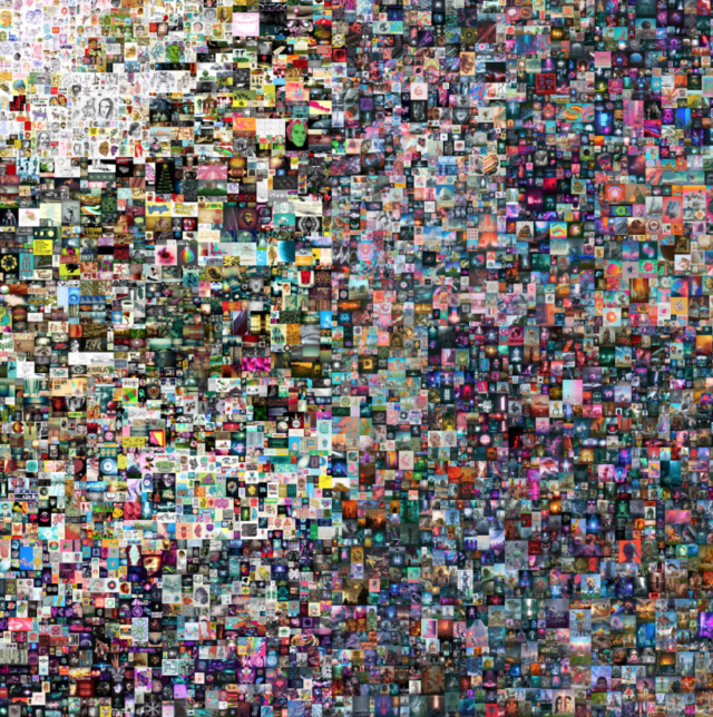
Beeple (b. 1981), EVERYDAYS: THE FIRST 5000 DAYS, 2021. Non-fungible token (jpg). 21,069 x 21,069 pixels (319,168,313 bytes). Minted on 16 February 2021. Starting Bid: $100. Hammer price: 6.6 million. Offered as a single lot sale concurrently with First Open. Online, 25 February to 11 March
On this episode of Explain Me we do a deep dive on Non-Fungible Tokens, NFTs, pronounced Nifty, but also N-F-T. Joined by guests Marina Galperina, features editor of Gizmodo, and former curator and writer on digital art, and Amy Whitaker, author and assistant professor of visual arts administration, hosts William Powhida and Paddy Johnson navigate the headlines generating news around this new digital currency, the basic definitions, and the potential and dangers it poses to artists.
40′ NFT platforms and markets. Massimo Franceschet and Sparrow Read’s The Inconvenient Truth About Secondary Markets, Part II 43′ Legacy Russell tweets about the toxic white male culture dominating NFT conversation. Follows up with a shout out to QTPOCIA+ and female-identified people engaging NFTs.
Amy Whitaker and Roman Kraussl, Fractional Equity, Blockchain, and the Future of Creative Work, Management Science, July 2020
Amy Whitaker, Art and Blockchain: A Primer, History, and Taxonomy of Blockchain Use Cases in the Arts, Artivate: A Journal of Entrepreneurship in the Arts. Summer 2019
Amy Whitaker, Hannah Grannemann, Artists’ Royalties and Performers’ Equity: A Ground-Up Approach to Social Impact Investment in Creative Fields, CMSE Vol 3, no 2, pg 33-51.
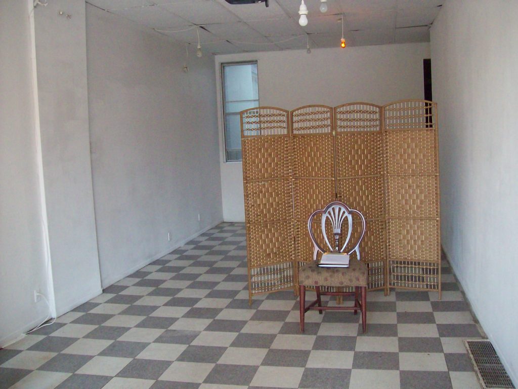
Documentation of R.M. Vaughan’s “Super-Diviner” (2014) at Videofag, Toronto
Some experiences I wish I could recall with clarity vanish almost as soon as they occur. Artist and writer RM Vaughan’s “Super-Diviner” (2014) performance marks one such instance: an unusually perceptive tarot reading I still regret not committing to memory. Held at the now defunct Toronto artspace Videofag, visitors were instructed to enter the storefront alone, take three cards from a pile of assorted divinatory decks, and silently slide them under the screen for a blind reading. After he was done, we were asked to rate the accuracy of what we were told. Vaughan couldn’t see who I was or what I looked like, but still made profound observations. I gave him a perfect score.
As soon as he’d given it, I forgot my reading, assuming I’d have another at some point. We were already friends, and later Richard became a regular contributor to Art F City, covering the Berlin arts scene with a discerning eye and acerbic wit.
I never got to pull another tarot card from his deck, though. On October 23rd 2020, two weeks after he went missing in Fredericton, New Brunswick, police found his body. The police assumed no foul play. Friends and family deduced the cause was suicide.
Two months have since passed, and Richard has been justifiably memorialized in obituaries, tributes, and even a video art program. Friends and colleagues brilliantly captured his humor and uncanny ability to perfectly capture the absurdity of our shared cultural experiences. As a queer artist and writer living in Toronto up until the last five years of his life, he worked as a tireless connector, advocating and supporting other queer creatives from the 80s through to his death. I don’t think he ever got the recognition he deserved, as many others not only observed in their obituaries, but made visible with the craft of their prose. We all want to write something Richard would like, which requires a dash of poetic levity mixed with unsparing prose.
I’m unsure Richard would enjoy this observation even if he begrudgingly respected it: he could be a real jerk, prone to the jealousy and insecurities we probably all have, but tortured by it in ways that sometimes destroyed friendship and trust.
I always forgave Richard for those qualities, though, because he was also amongst the most generous, affable people I have ever met. He often shared pitch ideas and contacts with other writers, a diminishing professional courtesy in the field. When my sister-in-law needed to raise money for an operation the Canadian healthcare system wouldn’t pay for, he offered to help connect her story to others in the Canadian media to raise awareness. In comment threads and editorials he always returned scorn with respect—even when unearned. I watched this first hand as he fielded ad hominem attacks in response to his contentious Art F City review of Amy Feldman’s show at Berlin’s Blain|Southern.
Richard knew how to generate conversation and debate, and did so fearlessly. His hilarious 2006 Canadian Art Magazine pan of the exhibition, Intertidal: Vancouver Art & Artists, at MuHKA Museum for Contemporary Art Antwerp used descriptives like “garbage” and “ugly” to rightly mock Vancouver photo-based art as some sort of vaunted cultural export. Canadian arts media, which thirsts for global recognition, perceived the review as sacrilegious in its dismissal as did many professionals. The diaries prompted an outraged letter from superstar photographer Jeff Wall, and so upset the art scene that one reader went so far as to compare him to Hitler. (Richard appropriately parlayed the response into a book deal of collected essays entitledCompared to Hitler.)
Richard’s craftiness helped him survive through leaner years. As I watch freelance writers on Twitter list out what they got paid for assignments this year, I think back to our industry conversations. Sure, we lamented the dwindling freelancer rates, but more often, we bemoaned the organizations who still owed us money. Like everyone who does this kind of work, he often had to wait six months or more before getting paid some meager amount. No one takes into account the amount of time a freelancer has to spend hounding people just to get paid.
I watched the resentment accumulate and weigh on Richard over the years, and when he disappeared, I learned his moods worsened during the COVID-10 lockdown. He needed more access to support than he received. As a culture that still debates the value of universal healthcare and basic income, we don’t doll out help in equal measure. We talk about those suffering from the virus, yet neglect the mental health issues arising from the lockdown. (In the U.S., morality has sunk to debating who should be willing to die. Illnesses like depression or post-traumatic stress disorder barely register.)
Richard tried to put a good face on this. In June, he wrote a humor piece for The Globe and Mailabout the humbling experience of moving in with a friend during lockdown and helping to manage the COVID anxiety of their 12 year old daughter. Not two sentences in, he told readers he considered himself “one of the lucky ones.” In the context of his mentorship, the sentiment made his death seem all the more cruel.
“Childhood anxiety is anxiety on amphetamines.” he wrote in the Globe. “Yesterday, I talked the kid down from a psychological ledge by explaining how it would be against the laws of physics for the COVID-19 virus to spread through electrical outlets. I know nothing about physics. Which brings us to my second tip. Just lie.”
It’s a funny line, but in retrospect I began to wonder if “lucky” was his lie. He’s dead. Then again, maybe we need to tell ourselves happier narratives, especially when we’re feeling down about ourselves or the world. At the very least, we start taking seriously the sometimes all-too-easily dismissed experiences of our children.
I can only speculate on what Richard felt, but I know for certain that death didn’t scare him. “I grew up in Atlantic Canada,” he told me in a 2018 piece I wrote for Garage about artists’ paranormal faith. “All the conversations I heard from adults included ghosts at some point. People talked about them in a very natural way—the way you might talk about the weather.”
I don’t believe ghosts spend their time in metropolises like Berlin or Toronto—giant cities exude too much energy for an afterlife to survive—so I’m glad he died in Fredericton, just over an hour from his birthplace, St John. The smaller Maritime center seems more friendly to spirits. Wherever he is now, I’m sure he’s found family and friends, along with the solace he couldn’t get here.
In this episode of Explain Me, we take stock of the year in art with Artnet’s National Critic Ben Davis.
What happened in the art world in 2020? We ask this knowing that we obviously have not seen a lot of art or attended anything remotely like a normal opening. But, a lot happened this year, even if we experienced it all at a distance.
We know that, with the vaccine slowly rolling out now, the art world will return, but what are the implications of the pandemic for the art world this coming fall and beyond?
In part one of this episode we discuss:
Baltimore Museum Deaccessioning, two opposing views.
In this episode of Explain Me we talk to Andy Adams (@FlakPhoto on instagram) a culture producer, and long time digital director. Andy is the founder of FlakPhoto Projects, an international community of photographers that operates in a parallel path to the one Powhida and Johnson come from—the New York based studio and museum world. Andy, William, and Paddy began working online around the same time—2003-2005, so we start our conversation there. We track through the exuberance and possibility we saw online in the early aughts, the economic collapse of the late aughts, and fraught political environment we’re now navigating. Subjects include: The signature FlakPhoto style, the ethics of documentary photography, and the the postponed Guston show at the Tate.
Jordan Casteel, “Within Reach”, New Museum installation view, 2020. Photo: Dario Lasagni
In this episode of Explain Me, critic and curator Antwaun Sargent joins us to discuss the effects of the pandemic and Alex Greenberger’s Zombie Figuration, a confusing essay that appeared earlier this month in ARTnews. In the first half hour we discuss the disparate effects of the pandemic and general politics. Then we move on to art, zombies, race, and why art has limits. ListenonSpotify,Stitcher,andApplePodcasts.
BIOGRAPHY
Antwaun Sargent is an art critic and a writer who has contributed to The New York Times, The New Yorker, Vice and more, as well as essays to multiple museum publications. His first book, “The New Black Vanguard: Photography between Art and Fashion” (Aperture) is out now. In April he announced a new partnership with Gagosian that will include working on four exhibitions and contributing features to their magazine. Follow him on Twitter and Instagram.
LISTENER ADVISORY: In this episode, Paddy Johnson occasionally repeats Antwaun Sargent’s words when his audio cuts out. This leads to periodic moments when Johnson and Sargent speak at the same time.
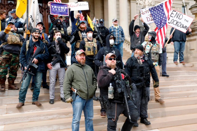
Boogaloo Boys show off posters supporting Trump at a demonstration
Artist Nayland Blake joins the podcast to discuss the murder of George Floyd at the hands of a white police officer, mass protests, and the resurgence of COVID as the backdrop for public art and how museums are addressing diversity. Spearheaded in large part by Blake, we discuss all of these issues through the lens of what people need and how art makers, art workers and arts institutions answer that need.
We started the conversation with Blake’s recent twitter thread on art criticism.
“Art criticism is the activity of thinking with and through art objects,” they wrote. “If you constantly reach for the same few objects to think with, you stagnate as a critic and simply reinforce your own bias.”
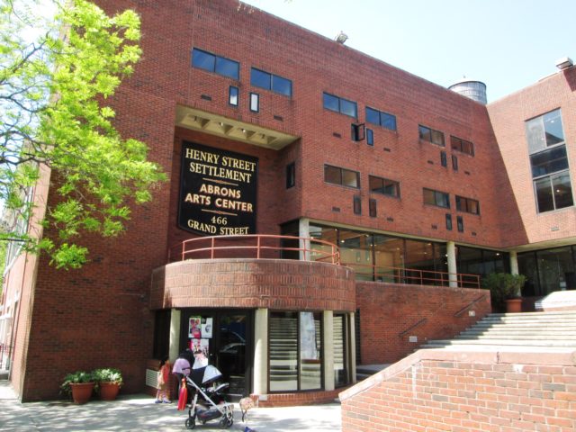
The Abrons Art Center has paid all their staff and performers during the shutdown.
This week on Explain Me, co-hosts William Powhida and Paddy Johnson talk to arts organizers and activists Heather Bhandari and Nikki Columbus about the challenges for mothers during the pandemic, and the challenges for arts workers seeking to make changes to a system that no longer works for them.
Of the family-focused topics discussed we take on pandemic screen time for kids (Bhandari describes DinoTrux as terrible for kids, but a necessary evil), what to do if your toddler licks a bodega door, and disrupted schedules that make it impossible to find or look for work and require long and often unusual hours.
On the subject of organizing we discuss several projects spearheaded by Bhandari and Columbus respectively designed to pave actionable paths for artists.
Finally we discuss Frieze New York, and contrast their dubious charity efforts during the fair to the more collective NADA art fair model that works towards a sustainable model for everyone. Show links below.
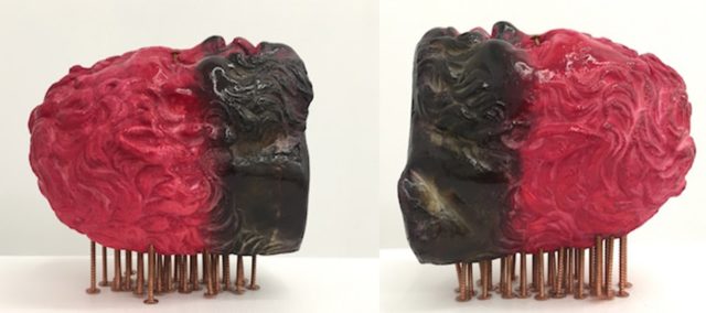
Steve Locke, Student 338, 2016, Hydrocal, galvanized steel nails, procion dye, shellac approximately 12×4.5×5.5″, $4,000. Link to item.
This week on Explain Me, William Powhida and Paddy Johnson speak with artist Michael Shaw and L.A. staff writer Carolina Miranda how quarantining is affecting artists, galleries and journalists on the West Coast. Shaw talks about the prospect of losing his studio of nine years, The L.A. Tenants Union and landlords who are neither friendly nor flexible. Miranda speaks about cuts at the L.A. Times and the surrounding museums, as well as her latest story on how corona is impacting commercial galleries.
We take a virtual visit to the Dallas Art Fair together, and talk about the art we’ve enjoyed recently. All links below.
Serkan Özkaya’s Proletarier Aller Länder (Workers of the World) 1999, Image via Postmaster’s Gallery.
In this episode of Explain Me, hosts Paddy Johnson and William Powhida talk to Magda Sawon of Postmasters Gallery in New York, and Jonathan Schwartz, the CEO and founder of Atelier4, an arts logistics company based out of New York. The discussion includes stories and conversations you won’t find anywhere else.
Schwartz reports that at least one logistics company is currently breaking the law to ship art, and that Fedex trucks are in short supply because they’re being used to transport the dead.
Magda describes the challenges for galleries which range from financial burdens to the need to better consider the online art environment.
William and Paddy discuss the financial precarity of artists, writers, and educators.
As a group we talk about what needs to be done to respond to the crisis and what is being done. We also make the mini announcement that we will be launching a Patreon for Explain Me in the next week or two. More details on that soon!
We’re looking at a radical shift in opportunity, so this conversation includes a fair amount of debate. We’re also doing it over zoom, with William on the phone due to an internet connectivity issue. This isn’t the best recording quality we’ve ever produced, but it might be the most important episode. Please tune in.
COMING UP: Resources for freelancers and art organizations. What relief is available and how long it will take to get to the people who need it.
Fiercely Independent. New York art news, reviews and culture commentary. Paddy Johnson, Editorial Director Michael Anthony Farley, Senior Editor Whitney Kimball, IMG MGMT Editor
Contact us at: paddyATartfcity.com